Berlin, 16.12.2010
Corporate Design and Consulting
Logo
Typography
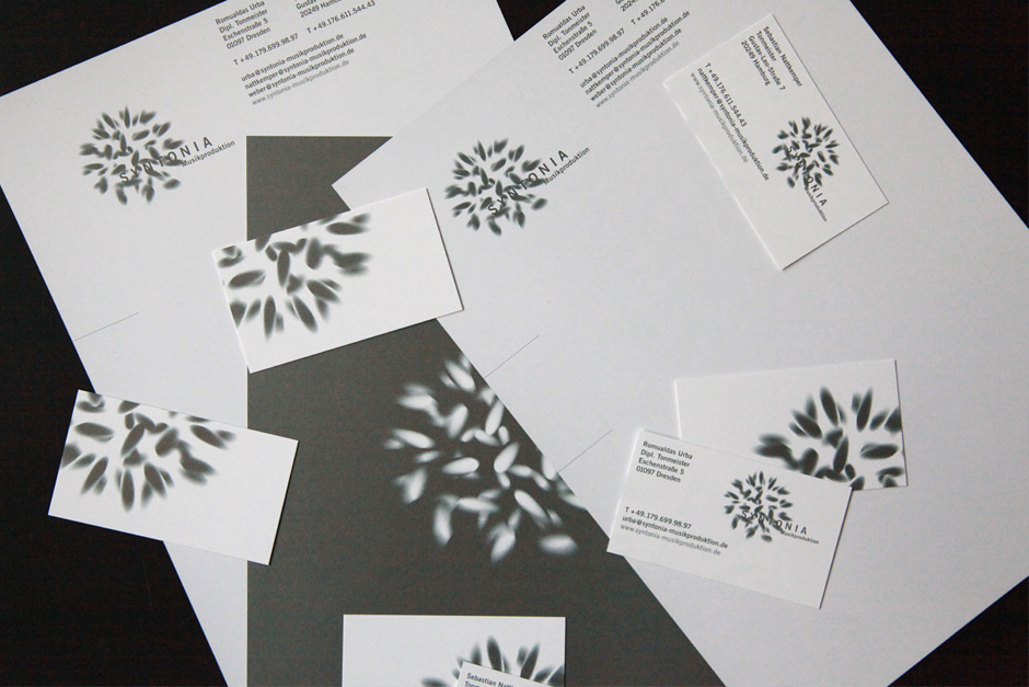
Corporate Design Modules
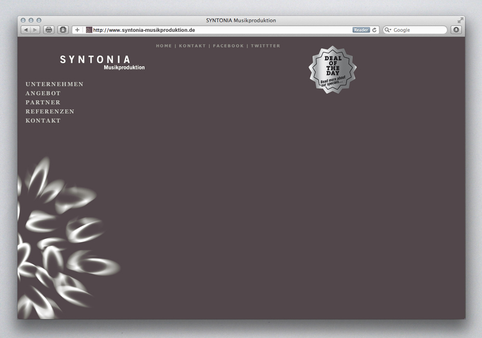
Website
Posters
Client:
SYNTONIA Music Production
Tonmeister Romualdas Urba
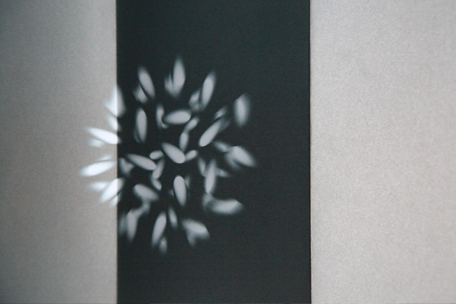
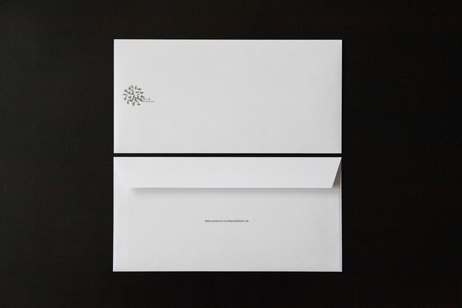
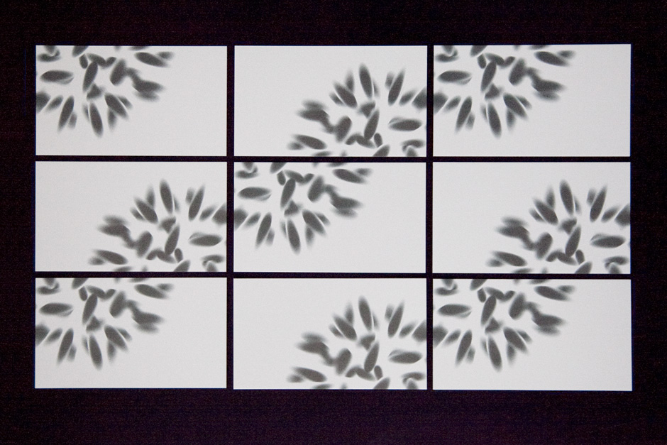
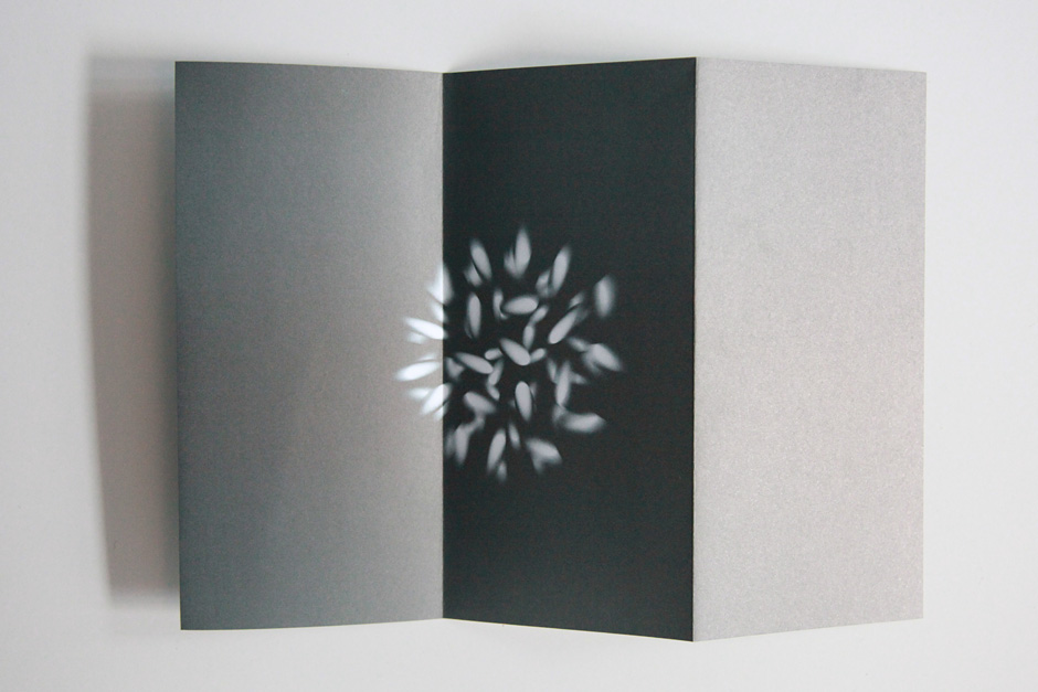
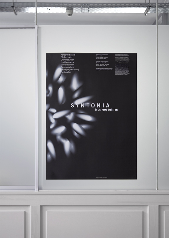
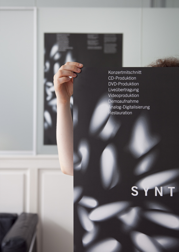
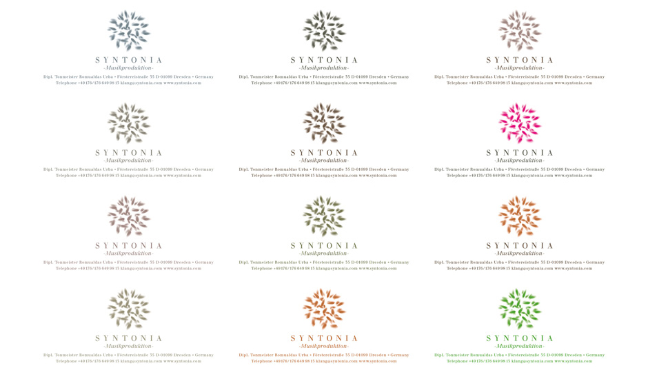
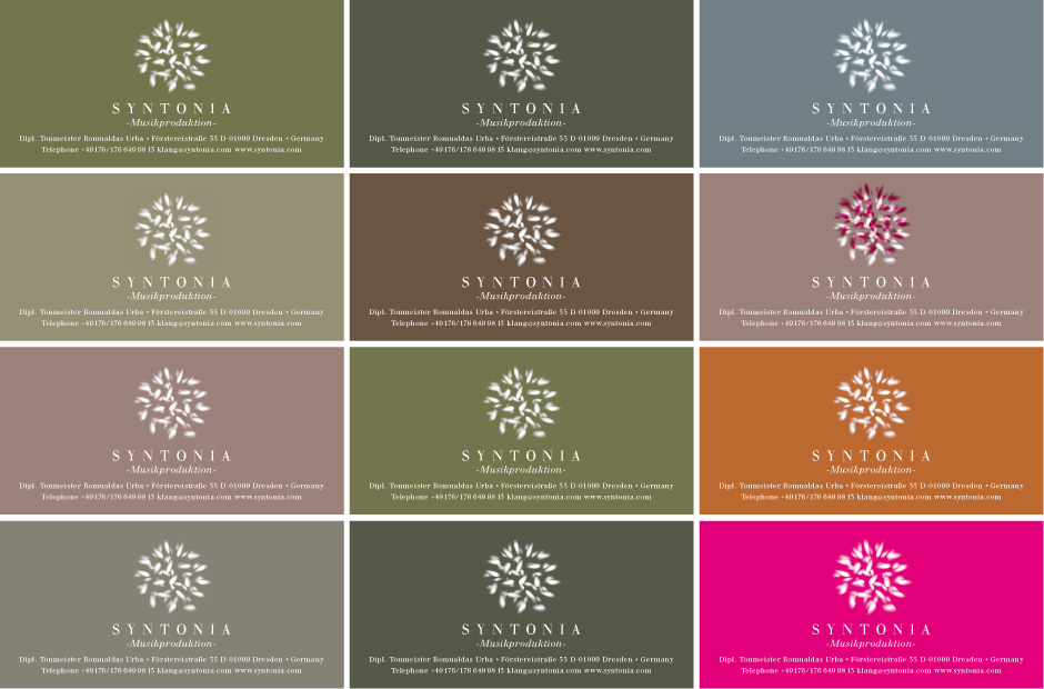
A Logo, a sound, a interpretation of the sound engineers working at Syntonia. A conserved, dynamic logo made out of form or maybe tones. A poetic vision of a in professional jargon called »Tonkonserve«. The colour of the logo with it´s typography sounds like a tuning by the sound engineers. Any time you look, it is different. Always rearranging it´s expression. Syntonia works on and engineers sounds. In a technical and artistic way.
www.urbaundweber.de (old website)
www.syntonia.de (new website, work in progress)
![]()
Further designs and scetches:


