


Die Fantastischen Vier Playtime Plakat EngenhartStuttgart, 11.5.2014
Playtime Organisation Stuttgart
Engenhart & Bui GbR
Playtime ®. One album, one evening.
Branding and Corporate Identity
in collaboration with Duc Thi Bui
Concept
Branding
Text
Corporate Communication
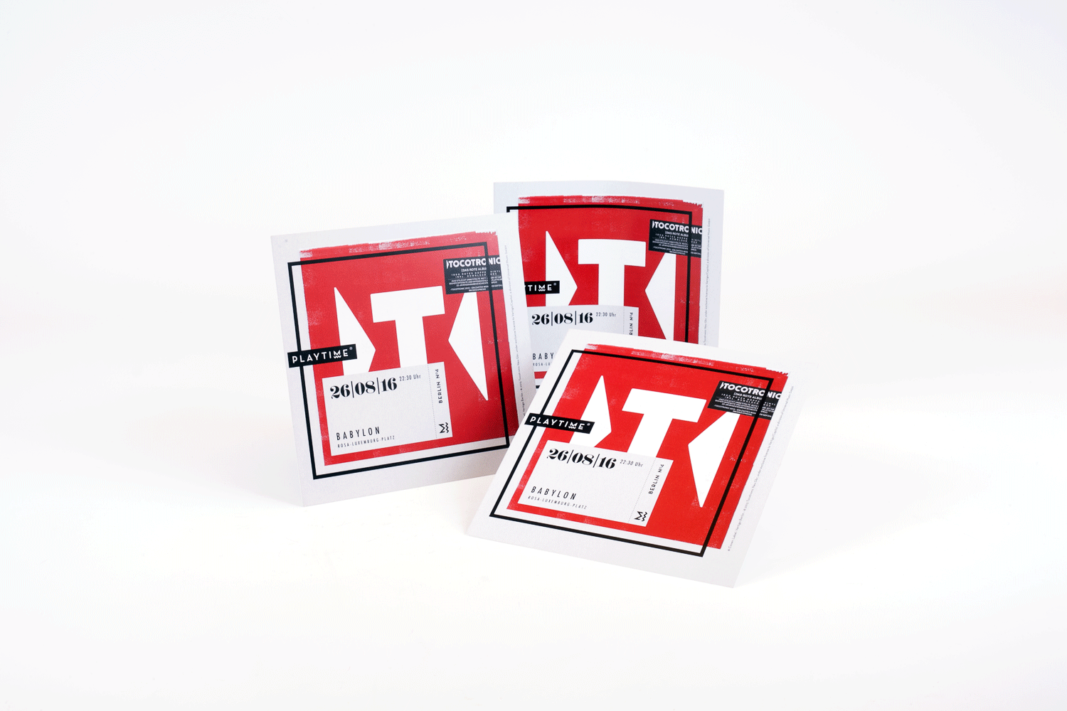
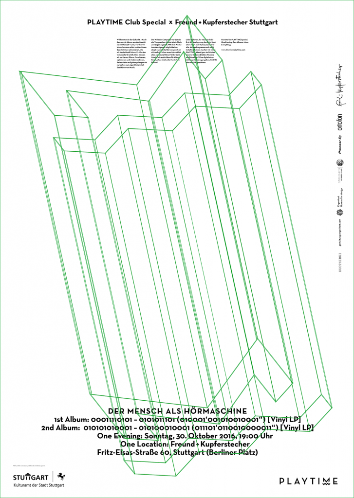
Posters
Public Relations
Website
Cinema Trailer
Logo
Social Media Integration
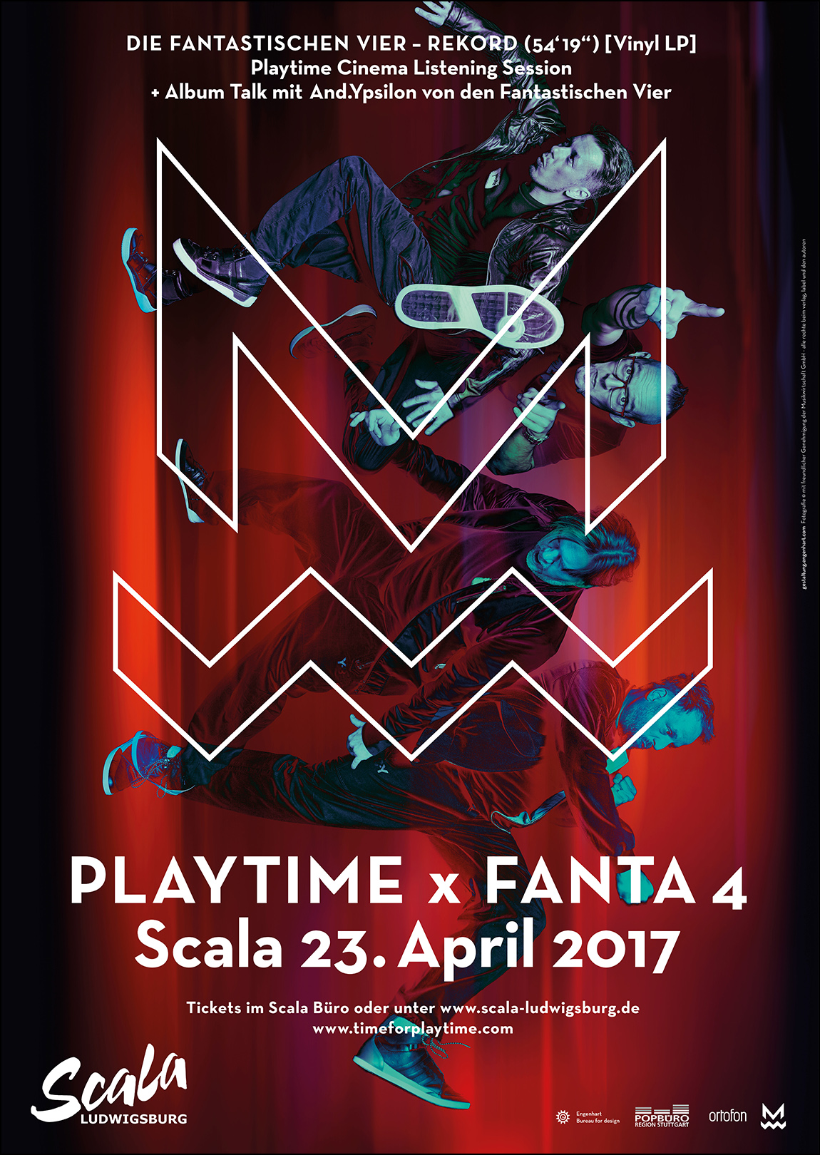
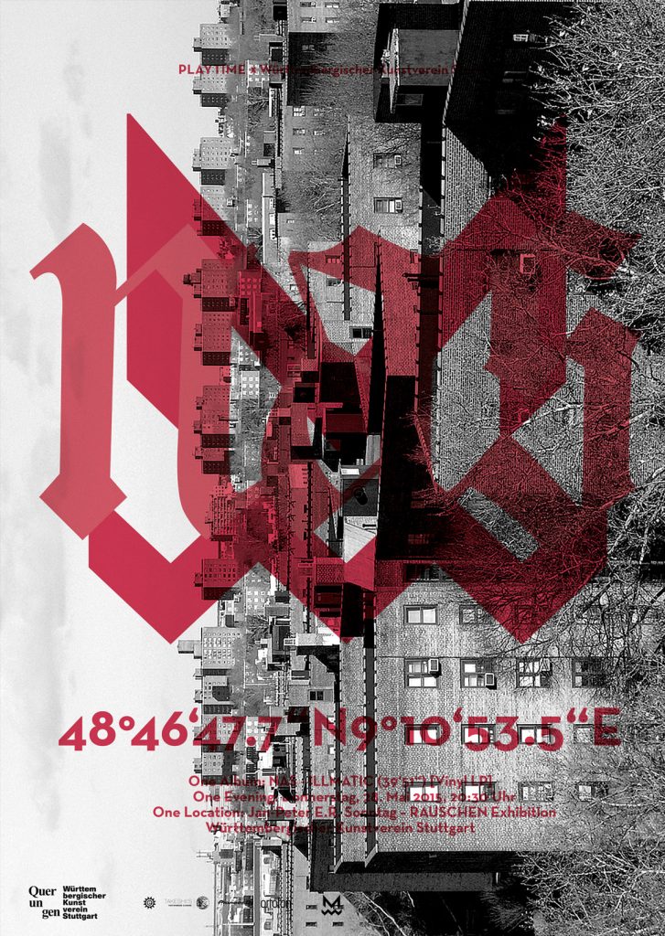
The Playtime logo design achieves its symbolic character through a simple device: By trimming the letter M on both sides, the pointy central tip of the Neutra Face M comes into sharp focus, thus recalling the pointy tip of a record needle. This is combined with a zigzag line that suggests both the groove of a vinyl record and the frequency line of music on an equalizer.
Since Playtime events always take place in venues like theaters or cinemas, the logo also encompasses the concept of a listening audience. The zigzag line could indicate a row of seats, and the trimmed M a curtain, just to name one possible interpretation.
The Playtime poster design references a typical movie poster layout in the arrangement of its elements and especially in the design of its text. The text, an abstract of the idea and intention of Playtime, is arranged and styled like movie poster credits. Furthermore, its reduction to white letters on a black background evokes the projection of content on a movie screen.
Playtime is presented by Engenhart.com.
www.thibui.de
www.timeforplaytime.com
* Causales Cultural Brand Award – Trendbrand of the year 2016 – nominated
* Graphis Poster Annual 2016 – Silver
* Red Dot Award Communication Design – award for high design quality
* German Design Award 2017 – Nominee