 Berlin, 18.11.2010
Visual Identity for the International Mahler Orchestra
Logo
Letter
Press Kit
Client: Yoel Gamzou (Artistic Director), Berlin
Without words. Only music.
www.gamzou.com
www.internationalmahlerorchestra.com

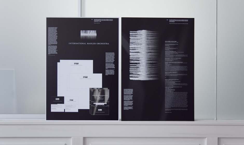
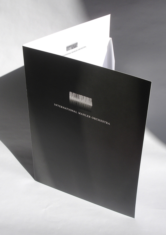
 This logo was specially designed for the International Mahler Orchestra to express concepts such as frequency, sound, contrast, and the relationship between life and death (an existential, recurring theme throughout Mahler’s life); it denotes a sphere of sound and a fantastic form metamorphosing from black to white and vice versa. It is also a graphical interpretation of the view from the cottage on Lake Attersee, Austria where Mahler composed. The shimmering, gently rippling surface of the water is comprised of countless particles—reflecting the musical vision shared by Yoel Gamzou and his orchestra with respect to Gustav Mahler’s artistry.
The logo is composed of the separate items in a catalogue of the complete works of Gustav Mahler: it comprises a list of the works, including their titles and dates of origin, arranged in chronological order (compiled by Andreas Michalek of the International Gustav Mahler Society, Vienna).
Beyond its function as a brand for the orchestra, the striking form of the logo conveys its inherent capacity to communicate. It is digitally transferable. Anyone who views it in a digital context, be it on the Internet or in a pdf document, may copy the contents of the logo and paste them onto another document. The logo comprises the entire register of Mahler’s oeuvre, which gives the logo its form.
The corporate design and visual identity appear in every form of media as a hand-drawn ink background upon which the logo is placed. The background depicts calligraphic details or fragments from Mahler’s hand-drawn scores in a new interpretation.
